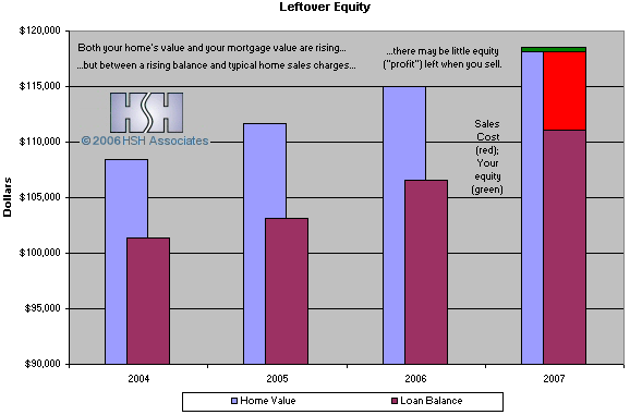
These charts accompany the article A Negative "Option" Explained.
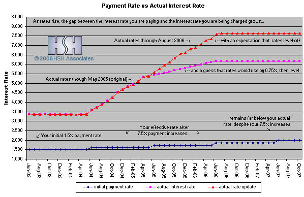
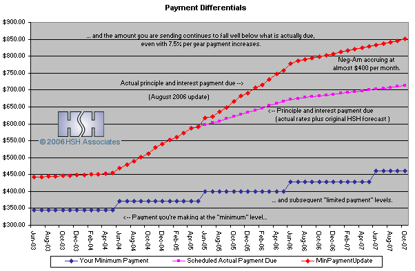
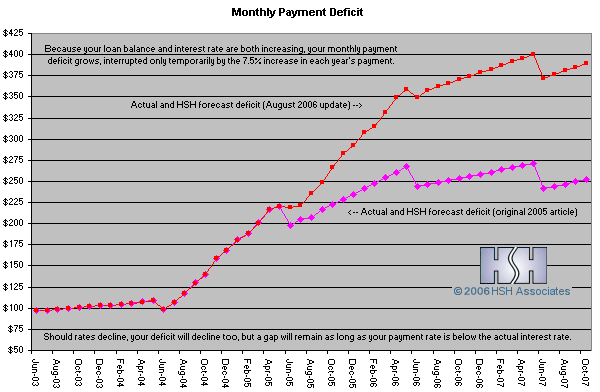
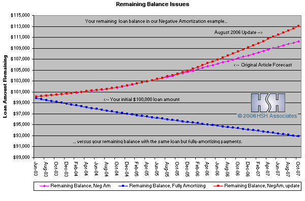
For these charts, we made what we think are realistic assumptions. First, we started with a one-month LIBOR-based option-style ARM in June 2003 with a minimum payment rate of 1.5%. Then, we followed the actual trajectory of interest rates from 2003 to May 2005. From there, we assumed that LIBOR (like other short-term interest rates) would rise a total of 0.75% over the next 12 months, then level off and hold steady for the next year after that. Most likely, the change to underlying interest rates won't be quite as smooth; the increase may be more or less than 0.75% over the next year, or rates may not hold steady after that. However, it's useful to know that over the last ten years, the average for the one-month LIBOR has been 4.119%, and our example never even gets as high as "average".
August 2006 Update:
As it turns out, our working estimate from May 2005 was far below the actual trajectory for interest rates. In the original article, the highest actual index rate we used was 3.1126%, and we figured that LIBOR would climb up to 3.8626% over the next year. However, by the August 2006 update, LIBOR stood at 5.4045%, with our loan's interest rate well into the mid 7% range. The excess increase in rates means that negative amortization rose more quickly and over a longer period, and the mortgage holder would now have almost no equity leftover after the home is sold. The charts now show our original estimates and the updates. Go to the article
